
Kylie Comte Tattoo – Logo
Kylie wanted to bring her vision of a tattoo studio to life, her vision was for something that had a vintage theme.
By working closely with Kylie, I was able to create a logo that fit her brief and her expectations completely.
You will note each colour has a gradient effect to give the logo depth and richness. The colours were created to specifically mimic gold, silver and copper.
This logo is a true masterpiece.

Hillross Riviera – Logo
Hillross Riviera is an existing brand that wanted a sub-brand logo created to compliment their current parent brand.
Working closely with their current brand guidelines, I used a san serif font to reflect a modern, engaging, honest and uncomplicated feel for their clients.
We tied in the blue with their current brand colour and added the green to reflect growth and balance. Perfect for the financial growth industry.

G.E.T Coffee Services – Logo
G.E.T Coffee Services was a great project for me to be involved in.
After I completed their branding they were the featured business for Small Business Victoria ( Government Initiative) – So that was pretty exciting for me!
The client wanted to have a clear image representation of their business, so I created the coffee cup with a coffee stain border and the tools within the cup suggesting repairs and maintenance. Red was used because it represents high energy (caffeine inspired) demands attention and creates a sense of urgency.
You’ll note the G.E.T and Gippsland Espresso Technician are highlighted as it is the business’ name. Dark Grey was used to balance the red and maintain a modern twist.


Trusted Finance Solutions – Printing
Trusted Finance Solutions have been a repeat customer for a long time now, their branding has been previously established by a different designer. TFS continue to trust us with their printed items due to our high standards in printing quality.

Magazine Design and Print
Kove was another project that the client had an existing brand that I was entrusted to create something visually amazing.
Working within their branding guidelines, I created a gloss A4 Magazine showcasing the amazing work they did on their homes.
The results was a beautifully curated product that clients could read through in all of their display homes. This design was highly regarded and as a result the Architect that worked with Kove also requested their own Magazine.

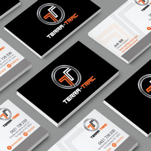
Print Collateral
Here are some more samples of printing that we have done for clients over the years.


Toongabbie Emergency Brochure – Design, Print
Latrobe City Council and Wellington Shire Initiative
I worked closely with a representative from the Latrobe City Council and Wellington Shire to produce an A4 Brochure for local and new residents as a guide and brief history on emergencies they may face whilst living in a rural setting. The brochure contains actual images from residents who had lived through both fire and floods in the town of Toongabbie. I designed the brochure using the 160 year old original logo from the town, being careful to incorporate the correct colours.

Various Designs and Applications


